in
android
firefox
free/open-source
gadget
news
software
Firefox for Android Tablets: Features and Expectations
If you’re a Firefox fan and an Android tablet user, there’s some great news for you. Mozilla will be releasing a Honeycomb version of their open source browser very soon. The record-breaking browser facing heavy competition from the likes of Chrome and Opera, has already stepped up their game by speeding up their release cycles. While that decision might not have been such a great success with users, the prospect of using a familiar and open source browser on an Android tablet already seems exciting.
Here’s what we can expect from the tablet version of our beloved Firefox.
What’s so great about Firefox on Android tablets?
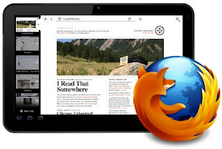
The UI: Well, the tablet version is quite different from the desktop or mobile version. In other words, it’s made specifically for tablets rather than clumsily fitting a desktop or mobile UI into a bigger form factor. The UI has been designed keeping in mind the utility and limitations of the tablets. Hence, you’ll find that the browser takes up a lot less space and makes full use of the small screen space.
Fits like a glove: The new user interface adapts nicely to the Honeycomb theme on Android 3.0. Firefox for tablets won’t be something that would look out of place on your tablet. In fact, it will look as if it’s meant for your Honeycomb tablet and nothing else. The buttons on the UI are rounded and look very much modern as compared to other browsers. Though it will look quite different from its mobile and desktop counterparts, Firefox will be sticking with the traditional back/forward buttons that always make it stand apart.


Ah, the very familiar AwesomeBar!: The Firefox you’ll see on Honeycomb will come with the popular AwesomeBar. For the uninitiated, the AwesomeBar is Firefox’s default address bar. It’s called AwesomeBar because of its intelligent prediction of webpages, which is done by indexing history and bookmarks. So, whenever you start typing something in Firefox’s address bar, you start seeing relevant suggestions from your history and bookmarks. For example, typing ‘t’ will recommend you twitter.com if you’ve visited it before or saved it in your bookmarks. The AwesomeBar is especially important for mobile devices, as here you have to minimize the user’s typing.
Better Tabs: Tabbing on Firefox for tablets works quite differently from how it works on mobiles or desktops. In landscape mode, the tabs appear as a persistent bar on the left hand side (much like the Unity launcher). You’ll also see a preview of the tabs so that you can get a better idea of the tabs that are active in the background. Many users might disagree with the new UI. However, the left bar makes it easy to switch between tabs using the left thumb while the right thumb can be used for scrolling or clicking links. In portrait mode, the tabs can be selected from a simple drop down menu thus saving a lot of screen space. Overall, the User Interface is simple and something most new users would love. Also, Firefox doesn’t try to do anything extraordinary here; it’s just focusing on keeping things simple, as it always has.
Firefox Sync: This is a feature that has been around for a quite a while. Yet, for some weird reasons, many folks haven’t even heard of it. Firefox Sync allows users to sync their browsing data seamlessly across various platforms and devices. So, if you’ve opened 5 tabs on your laptop, and say your battery runs out, then you can access the same tabs from your other devices which have Firefox on them. This is as an incredibly powerful feature that makes Firefox a heavyweight as far as the browser wars are considered. Having syncing capabilities on tablets will ensure that Firefox loyalists on the desktop and mobile won’t use anything other than Firefox for all their browsing needs.
What makes it uncool?
Ok, the mockups look very impressive, but will Firefox really be able to deliver on this platform? Here are some things that might not work in favor of the open source browser.
Dolphin and other competitors: The browser scene on tablets and mobiles may not be quite as competitive as on the desktop, but there are some quality applications that might make things tough for Firefox. Most of the users usually stick to the default browser in Android as it pretty much has all the features most users need. If they want an alternative Android web browser, then, Dolphin is something they can always download. Dolphin already has features that make it the best browser for Android, and to beat such a heavyweight will not be an easy task. Let’s hope that Mozilla will be able to convince enough users to move from this veteran browser.
What’s in it for Mozilla?
Firefox Mobile is Mozilla’s chance to make up for the market it lost to Chrome. Firefox for tablets will give it a necessary shot in the arm by increasing its adoption across other platforms too. Let’s hope they make it big.
Written by: Abhishek, a regular TechSource contributor and a long-time FOSS advocate.


Also Google is going to start branding the default browser on Android as Chrome and if people see the Chrome icon on their Android phone/tablet they'll probably not bother downloading other browsers because they already recognise and like the default one.
ReplyDelete